MoodBoard

Goal


Sunway Pyramid...a very high standard shopping mall...even though i always go for "makan"...because of the enviroment inside is very nice n egypt feel...n mostly the shop is aim for those working level people...so the price there some how a bit expensive...n one more thing...there is a lot of entertainment inside the pyramid...so its quite interesting for those youngster...the website is fill with orange color...its warm...same as in the pyramid...n the flash will change with the event tgt...n the information its give is enough...n clear...
Mid Valley

www.midvalley.com.my
Mid Valley...the most strong competitor to the Bangsa Village II...bcoz both of the shopping center is quite near...so people either chose mid valley or bangsa village...Mid Valley...is a huge shopping center...n a lot off thing to buy inside...bout the website...everything is vr neat n steady...its user friendly...n easy to get the information...


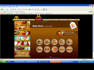
KFC
 "It's Finger Lickin' Good"
http://www.kfc.com.my/
I love KFC also...Kekekekekekeke...^^...one of my favourite also...=p...ok...come to the topic...realized tat?? KFC main page is already showing their product n their package d...(so rush to aim for moeny meh...LoL...) dont sue me...XD...Bout the pages...is in orange color...i like it...is warm...^^ n the text here is more readable then the Mc'D website...(mayb bcoz of the brighter color gua...) those button is quite userfriendly n obviouse...i dont like the flash...coz all of the flash is showing ppl eating the kfc meal...Ggggrrrrrrrrrr...its make me feel hungry now...!!!
Grid Analysis:


Burger King
 "Have It Your Way"
http://www.bk.com/
"BURGR KING" the most i like...coz the burger is big...n juicy...Wakakakakakakakakakaka...this website...use more flash then the other 2...(Mc'D n KFC)...n i like the flash...its funny...n nice...i like the color mood...its so bright n clean...but one thing is...its cannot skip the flash...once u dont want to watch the flash...it was so boring when u keep watching the same flash...==a...oh ya...there is a search engine for this "bk" website...its nice...^^
Grid Analysis:


 I like the way she do this website(i think is a "she" la...==a)...eventhough i cannot understand what was the website talking about...but the button there is very cute and very attractive...and one more thing the color she use is very suit for the website, its because it is actually present the fashion of the cloth, the style...so put the background in a cold gray color with colorful icon(i mean for the home page)...it is nice...and its also user friendly...once we click on different icon, it bring us to another page which is totally different with other page(different animation also...)


HoHoHo...This illus style of webpage...WoW...I like it very much...the icon it look really combine together with the webpage...and it really match with the product..."jeans"...ya the layout is very nice, eventhough its look like very western kind...the color...wow...the flash of the card is very cool!!! and one more thing they use guys and gals picture to represent the icon that which is link to another pages...it is fun...


 Ermmmmm...quite a scary webpage...==a as the address we can know that the method for this website is by using scary stuff for everything...like using bugs as the button...the design very nice...its bring out the feel of their band...very cool flash...
 Yup...a blue color background webpage...very nice right^^ i like this webpage a lot...because of the color...it is very colorful...and it looks like i'm playing a game by using webpage...the character is very cute...and also the icon it also related with the webpage...
Ok...Tats the end...


