Thursday, January 31, 2008

Mission Statement

Ok...Here comes with the "Mission Statement"...
My Client...Bangsa Village II...(http://www.bangsarvillage.com/)

Redesign
Base on my research...actually BV2 is not exactly a boutique and fashion based shopping center...so i will try to make it into a vr classical feel of website...and bcoz of the chinese new year coming...so i would like to redesign it into a chinese new year feel website...something which is in quite classical n mordern mixtured feel...this concept is actually based on the event...once the event or celebration is coming...the website will update into the certain event feel...to make people feel more interesting and fresh...and not so boring tat everytime log into the website...n it will bring people surprise too...^^
The site will b divided into 5 part...which is Fashion, Home & Living, Dining, Wellness, n Others...purpose is to let people easily to find what they want through the website...i will try to make it more userfriendly...n to let people feel more comfort when they serch on the thing tat they want...n also...i will bring into the map for the shopping mall...to let ppl easy to analysis bout the location of those shop...to save their time...
Target Audience
  • Age range around 21+ - 40+
  • Housewife
  • Working Class
  • Family
  • Health Care Class

Goal

  1. A userfriendly site.
  2. Easy to navigate.
  3. Font size will b bigger.
  4. consistancy layout.
  5. Enough of information.

Thursday, January 24, 2008

Yo...Yo...I'm Bk Again...

Competitors


Sungei Wang


Sungei Wang...as we know...is a lot of thing inside right...kekeke...^^a nice place to shop right...kekeke...this shopping mall...always lot of people...n its cramp inside...even though


it is cramp...but people still want to go there right...ya...bcoz of the location...the thing it sell inside is more on normal n above income class of people...so is so suit to every body...the shopping mall is cramp...but the webpage is nice n neat...n vr easy to get the information that we want...theres lot of links...n map...^^


Sunway Pyramid

www.sunway.com.my/pyramid/

Sunway Pyramid...a very high standard shopping mall...even though i always go for "makan"...because of the enviroment inside is very nice n egypt feel...n mostly the shop is aim for those working level people...so the price there some how a bit expensive...n one more thing...there is a lot of entertainment inside the pyramid...so its quite interesting for those youngster...the website is fill with orange color...its warm...same as in the pyramid...n the flash will change with the event tgt...n the information its give is enough...n clear...


Mid Valley
www.midvalley.com.my

Mid Valley...the most strong competitor to the Bangsa Village II...bcoz both of the shopping center is quite near...so people either chose mid valley or bangsa village...Mid Valley...is a huge shopping center...n a lot off thing to buy inside...bout the website...everything is vr neat n steady...its user friendly...n easy to get the information...


Friday, January 18, 2008

Yo...I'm Bk...

Mc'D
Ya...I love Mc'D...
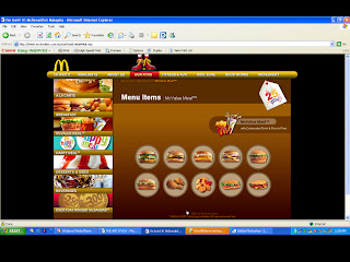
I like their way to provide the information in the website...n the flash is very friendly n happy feeling...the button...ya is clickable n looks like a button also...the colors...yo is nice n "Mc'd feel"very strong...lol...oh...yip...bout the scroll bar...not really need tat also...(i think...==a)
Grid Analysis:


KFC"It's Finger Lickin' Good"
http://www.kfc.com.my/

I love KFC also...Kekekekekekeke...^^...one of my favourite also...=p...ok...come to the topic...realized tat?? KFC main page is already showing their product n their package d...(so rush to aim for moeny meh...LoL...) dont sue me...XD...Bout the pages...is in orange color...i like it...is warm...^^ n the text here is more readable then the Mc'D website...(mayb bcoz of the brighter color gua...) those button is quite userfriendly n obviouse...i dont like the flash...coz all of the flash is showing ppl eating the kfc meal...Ggggrrrrrrrrrr...its make me feel hungry now...!!!


Grid Analysis:


Burger King"Have It Your Way"
http://www.bk.com/

"BURGR KING" the most i like...coz the burger is big...n juicy...Wakakakakakakakakakaka...this website...use more flash then the other 2...(Mc'D n KFC)...n i like the flash...its funny...n nice...i like the color mood...its so bright n clean...but one thing is...its cannot skip the flash...once u dont want to watch the flash...it was so boring when u keep watching the same flash...==a...oh ya...there is a search engine for this "bk" website...its nice...^^

Grid Analysis: